New York
Marc by Marc Jacobs
F/W 2013
Marc Jacobs takes us further back in time where women's clothing was inspired to wear military attire. He changes the colors by adding geometric prints and added a different flare to the vintage floral print. The colors used were black, wine, toffee, eggplant, charcoal, navy, cornflower blue, royal blue, emerald green, tomato red, rust, teal, oxblood, and cranberry. As for materials he used silk, satin, cotton poplin, wool, jersey, faux fur, and rayon. The silhouettes are based on the 40's which is tailor fit, military, and slim. This collection caught my eye because of the prints that were used and the tailored looks that create a grown up look.
London
London
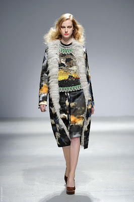
Felder Felder
F/W 13
The sisters have change their direction by creating mature looks that can be easily be worn anywhere at anytime. The colors used for this collection includes burgundy, cream, gold, lime, blush, black, and navy. Prints were seen on skirts and dresses and they were simply gorgeous! The print looks like paint splatter. Fabrics that were used throughout the collection was felted wool, organza, velvet,cloque, burnout velvet, curly fur, patent and matte leather. The silhouettes that were featured are mainly A-line, hourglass, fitted, long, and lean. I enjoyed looking at this collection because I believe the colors, the looks, and the different variety of garments created simplicity and it all worked together.
Milan
Bottega Veneta
F/W 2013
Bottega Veneta for fall used different techniques to show off a woman's body. The silhouettes are also based on the 40's but it's mixed with an Asian influence. It also includes broad-shoulders, hourglass, A-line, and roundness. The main colors that were used were black, ivory, lipstick red, goldenrod, caramel, bronze, and navy. From the the different inspirations the designer used materials that would form the origami shapes; for example, double-face crepe, firm wool, satin, chiffon, tulle, suiting, and lustrous charmeuse. There was not allot of print used but trims were used to create a particular style which formed geometric shapes.
Paris
Manish Arora F/W 2013
Manish Arora called this collection "Desert Hallucination," which in my opinion fits well overall. His whole collection was very beautiful and fashion forward. Yes, the silhouettes are the same as any other designer for this season, but the colors, accessories, embellishments, and prints make it unique. Colors that were used are navy, sky blue, white, black, sand, mustard, coral, electric orange, fuchsia, forest green, deep cobalt, emerald, gold, and lavender. He used brocade, lurex, stretch satin, fur, jersey, and leather. Through his collection patterns were psychedelic geometric as for prints they were, clouds, stripes, woven motifs, and mirrored neon tube repeats. This collection is a most see because it will take your breath away.
(Stylesight.com, WWD.com, Style.com)


Great write up Anacelia! A nice dissection of the garments through color, shape, texture, and a brief note about the inspiration / history.
ReplyDeleteThe last dimension, inspiration, really intrigues me because it calls into question how designers analyze the world around them to synthesize something new. I say intriguing because I am trying to reconcile the ability to view something that isn't yours and make it into something new. How, as a designer, are the styles that are based on cultural influences (for instance, the Desert Hallucination) not a new form of misappropriation or stealing someone else's culture in much the same way colonialism stripped the lands of the people who were here before us? Once you can answer this, I feel like you will have a strong voice and opinion about how design helps the world stay connected in a positive manner. Also, make sure to share your techniques, skills, and ideas with those that you meet. ;)